Challenge:
This activewear client was seeking a unique and bold brand identity that would stand out in an
over-saturated market. The product's major point of difference is its lightweight and flexible design, which attracts young, hyperactive, and sporty consumers.
over-saturated market. The product's major point of difference is its lightweight and flexible design, which attracts young, hyperactive, and sporty consumers.
Solution:
After multiple brand naming workshops with the client, we settled on Aviate. This was to represent the idea of flight and freedom associated with the brand's ultralightweight apparel. During the ideation stage of the project, I continued to explore the concepts of flight and movement, and eventually how these could be applied to the letterforms of the brand name.

Delivery:
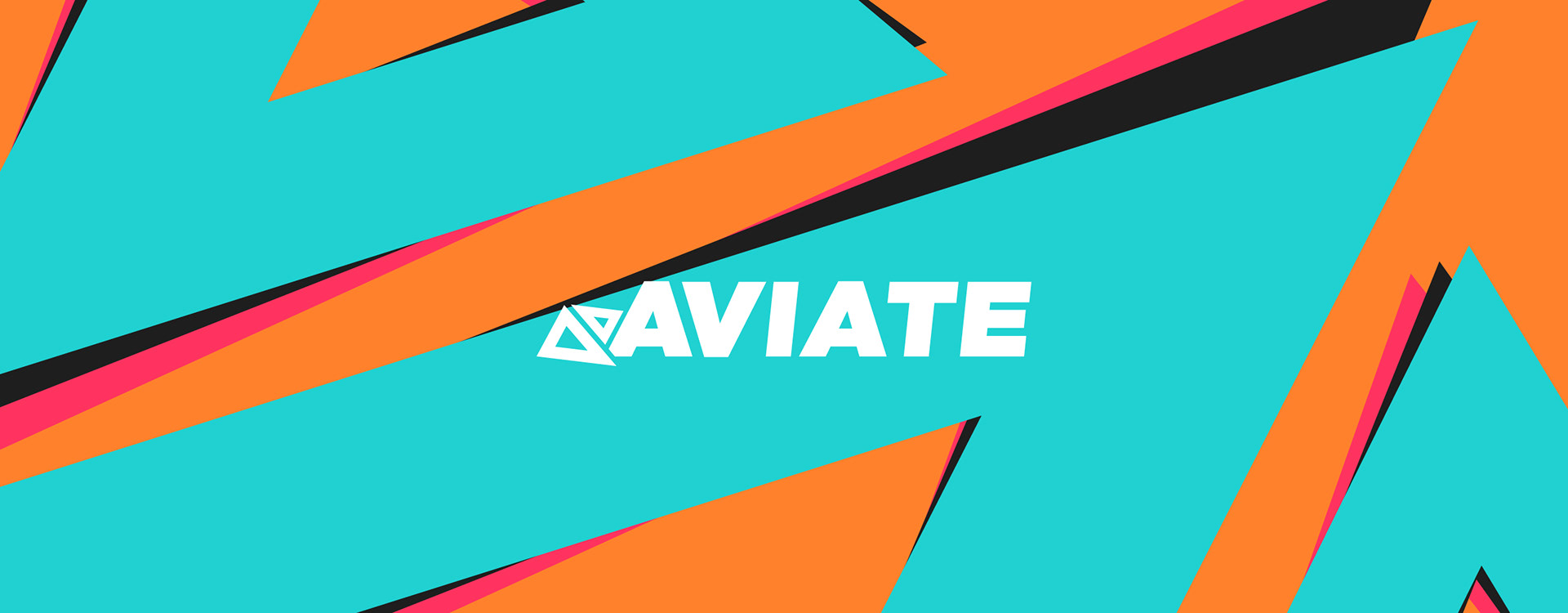
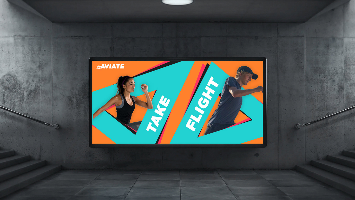
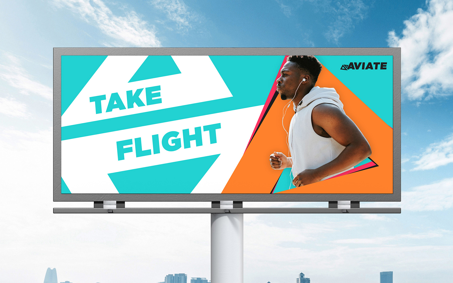
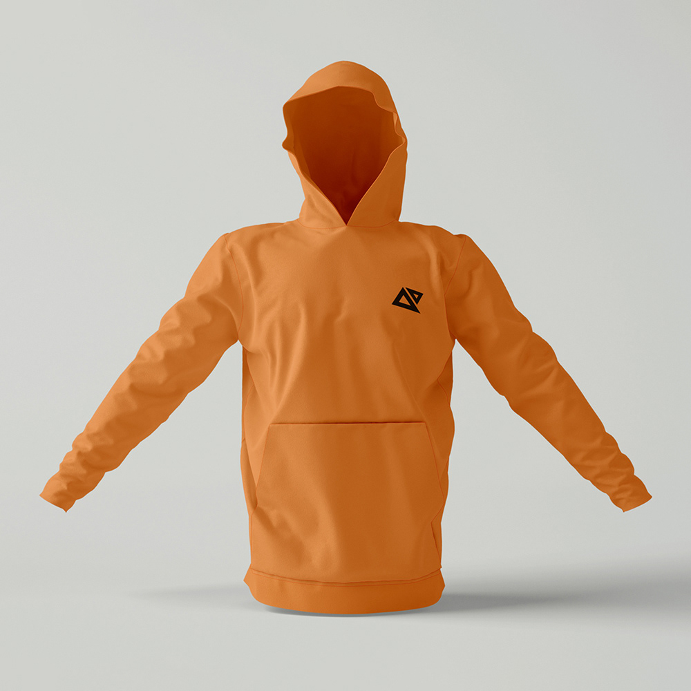
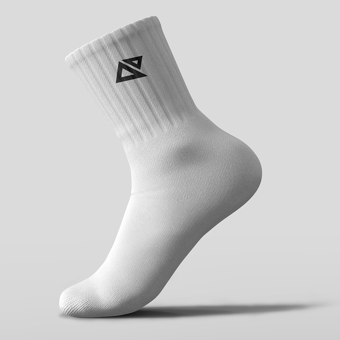
The final logo concept depicts two triangular forms reflected against each other that encompass the themes of flight and motion, whilst mimicking the form of the first two letters of the brand name. The triangular shapes represent flight and aviation and are positioned as if they are sliding across each other, which is reinforced by their skewed forms.
This feeling of motion is supported by the vibrancy of Aviate’s colour scheme. The contrasting fluorescent colours are bold and eye-catching, making the brand identity exciting and providing the cut-through requested by the client.
The Aviate brand identity appears to always be in motion, just as its target audience is.
This activewear client was seeking a unique and bold brand identity that would stand out in an
over-saturated market. The product's major point of difference is its lightweight and flexible design, which attracts young, hyperactive, and sporty consumers.
over-saturated market. The product's major point of difference is its lightweight and flexible design, which attracts young, hyperactive, and sporty consumers.
The final logo concept depicts two triangular forms reflected against each other that encompass the themes of flight and motion, whilst mimicking the form of the first two letters of the brand name. The triangular shapes represent flight and aviation and are positioned as if they are sliding across each other, which is reinforced by their skewed forms.