Challenge:
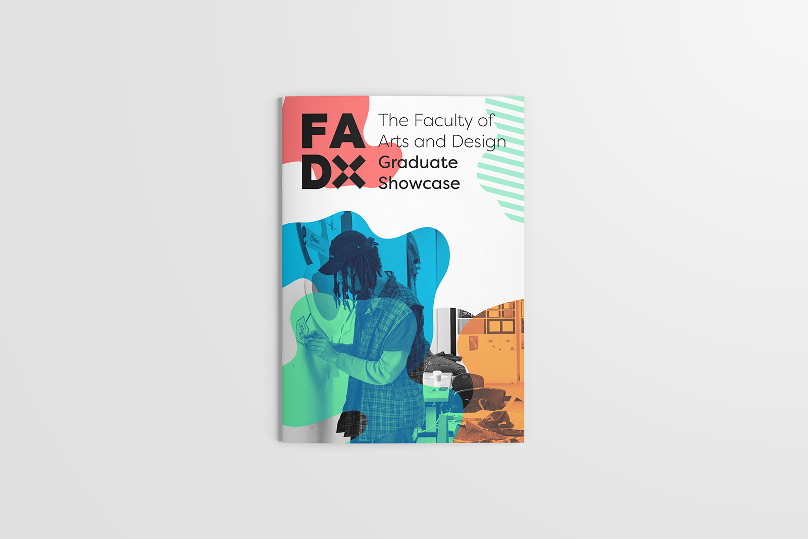
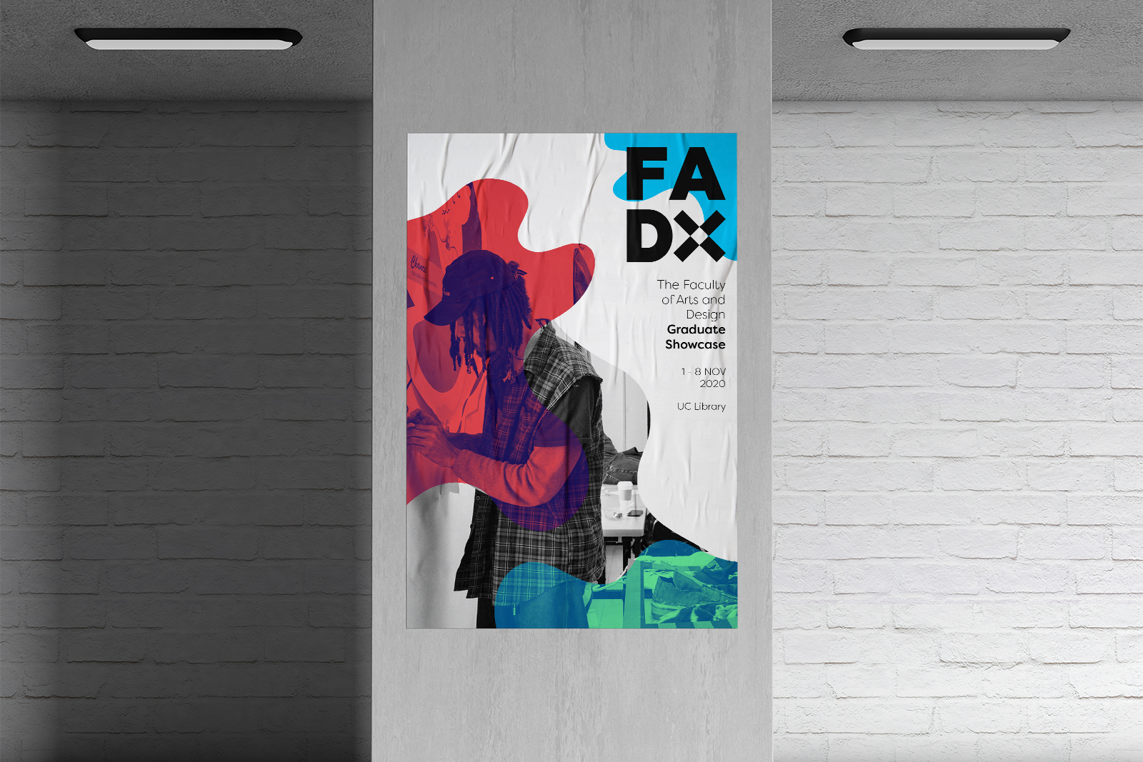
FADx is the University of Canberra Faculty of Arts and Design’s annual graduate creative showcase. In 2020 the Faculty were seeking a rebrand for the exhibition that was fresh, uplifting and encompassed what FADx is all about. It was a requirement that the existing X symbol be used in the branding. The Faculty outlined that the brand should be student focused, but show a level of professionalism that attracts industry representatives.
A distinctive trait of the FADx brand is the combination of creativity and sophistication. Students are encouraged to have fun and experiment with their work, but show professionalism in their presentation and quality of work.
The challenge then for this brand was to represent these contrasting themes throughout a single identity system.
Solution:
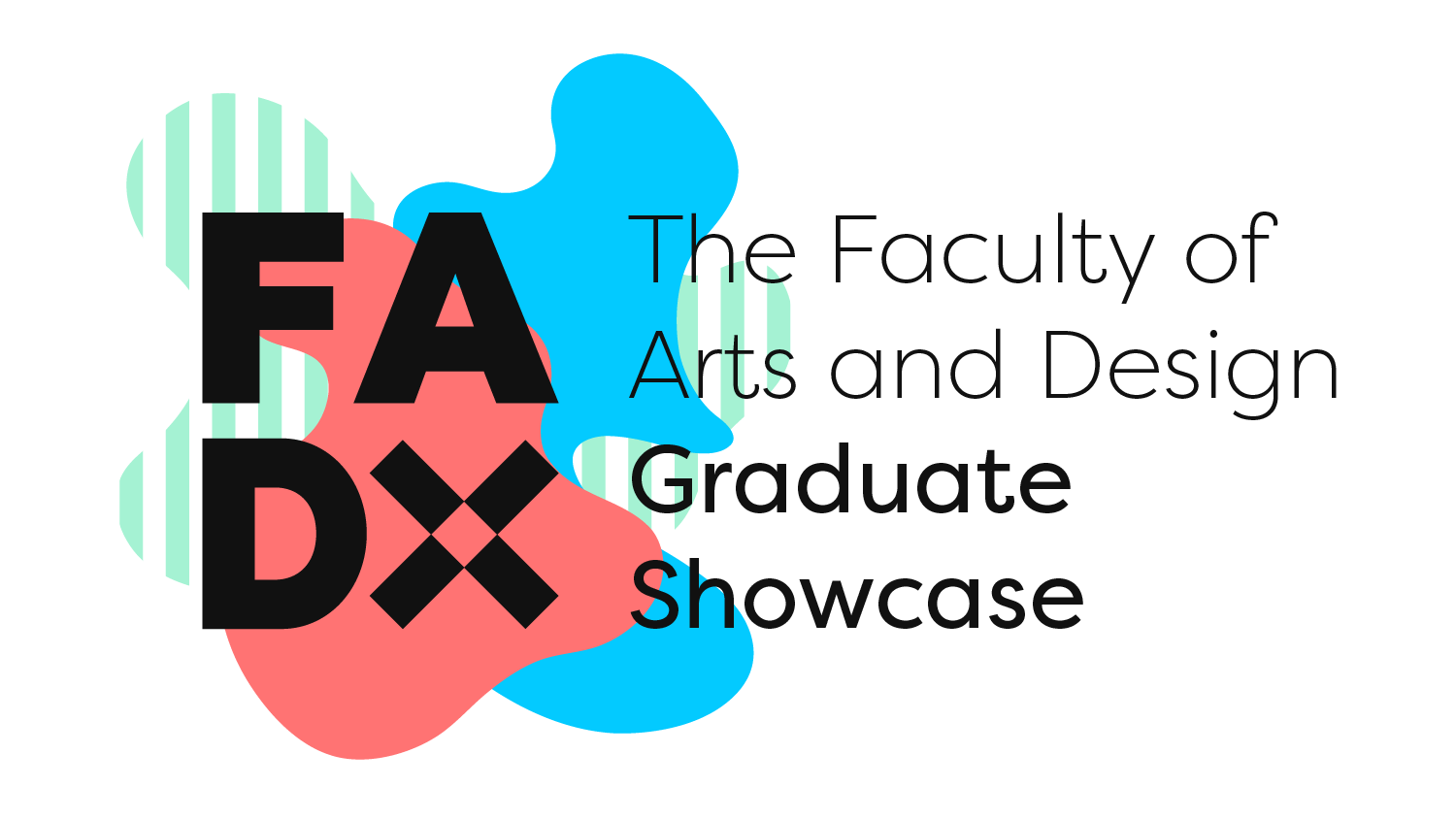
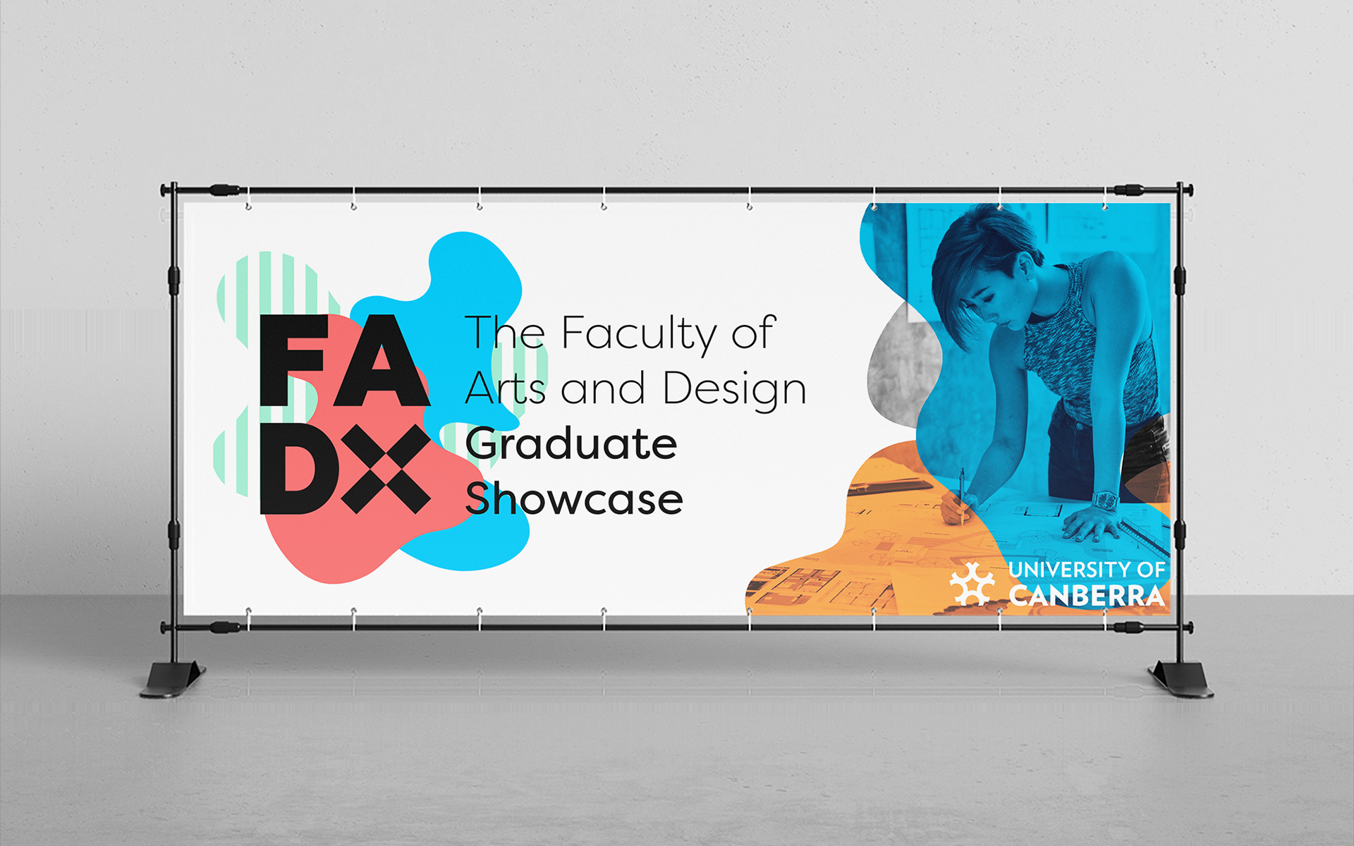
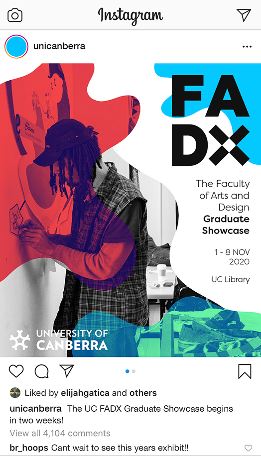
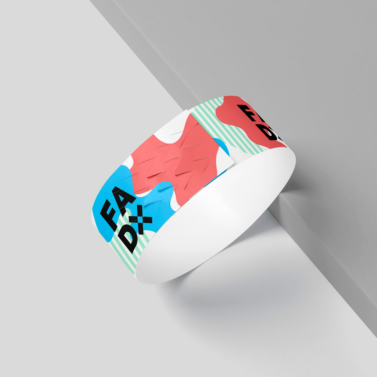
My concept focused on a contemporary approach that juxtaposed geometric typography with vibrant colour and fluid forms. The bold and sleek typography takes inspiration from contemporary art galleries such as the MoMA. Whilst the duotone gradient effect was inspired by modern design trends seen in youthful brands like Spotify. The use of fluid forms/shapes breathed further life into the visual language, particularly for static imagery.
My concept was chosen as runner up in the branding contest, and I was the highest placed single entrant. The minimalist typography in the logo marks, vibrant colour scheme, and fluid forms were cited as a visually striking combination by the judges.