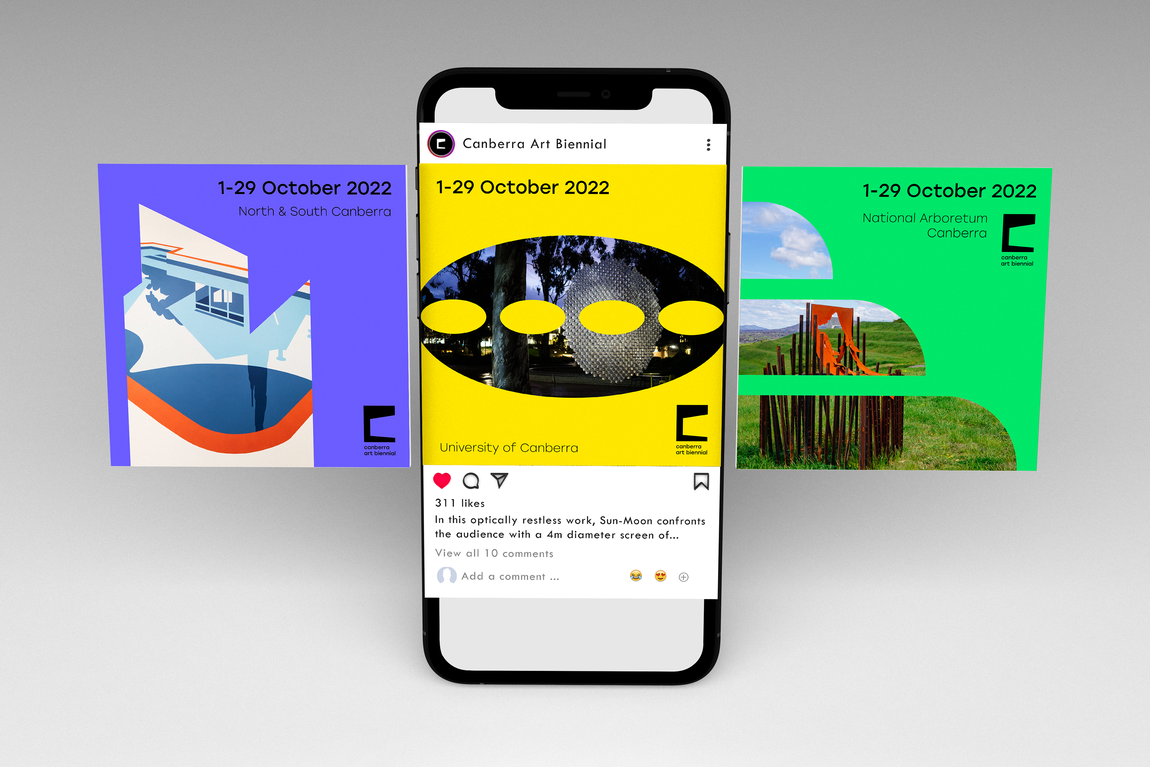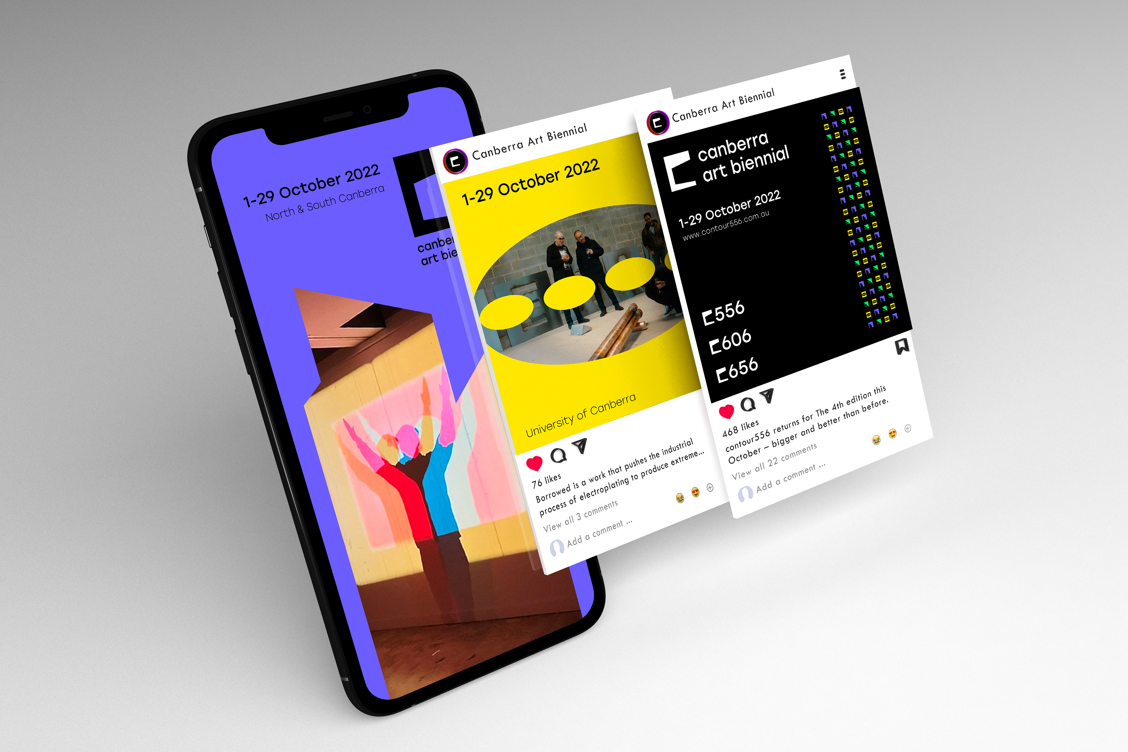
Canberra Art Biennial is a month-long art festival held every two years across Canberra, curated by Neil Hobbs. The festival was formerly known as ‘contour 556’ and was exclusive to central Canberra, but in 2022 the festival expanded to include two other sites; contour 606 and contour 656.
Each of the three sites is named after its height above sea level, purposefully linking each site in name as well as in purpose to the history of the Canberra landscape. The artworks and installations selected for the festival respond in some way to Canberra’s history, from 50,000 years to the present day. The festival offers the Canberra, Australian, and international communities a unique opportunity to engage with and understand the layers of Canberra’s history through art.
The brief outlined the need for a new overarching brand, Canberra Art Biennial, that would accommodate the expansion of the festival. The final deliverable would be a brand identity featuring the three festival locations as sub-brands. The client emphasised the need for a new interpretation of the ‘contour’ theme the brand is built on. This important insight lead to further discussion with the client which identified my focus areas for the visual identity:
Explore the different
meanings of ‘contour’.
meanings of ‘contour’.
- Form and shape
- Boundaries/limits
- Outlook/appearance
Installations are
Transformative by Nature.
Transformative by Nature.
Our ideas/perceptions are challenged and influenced.
This is a core principle of the Canberra Art Biennial installations.
Concept
This mark brings together an icon of the Canberra landscape with the concept of framing. It represents how art can frame concepts using form, shape, and depiction to influence the audiences perceptions.
The form of Parliament House is used in the negative space as the subject in focus. The surrounding frame symbolises Canberra Art Biennial and it’s purpose to inform and educate audiences on the layers of Canberra’s history.


Extended Brand identity
hh
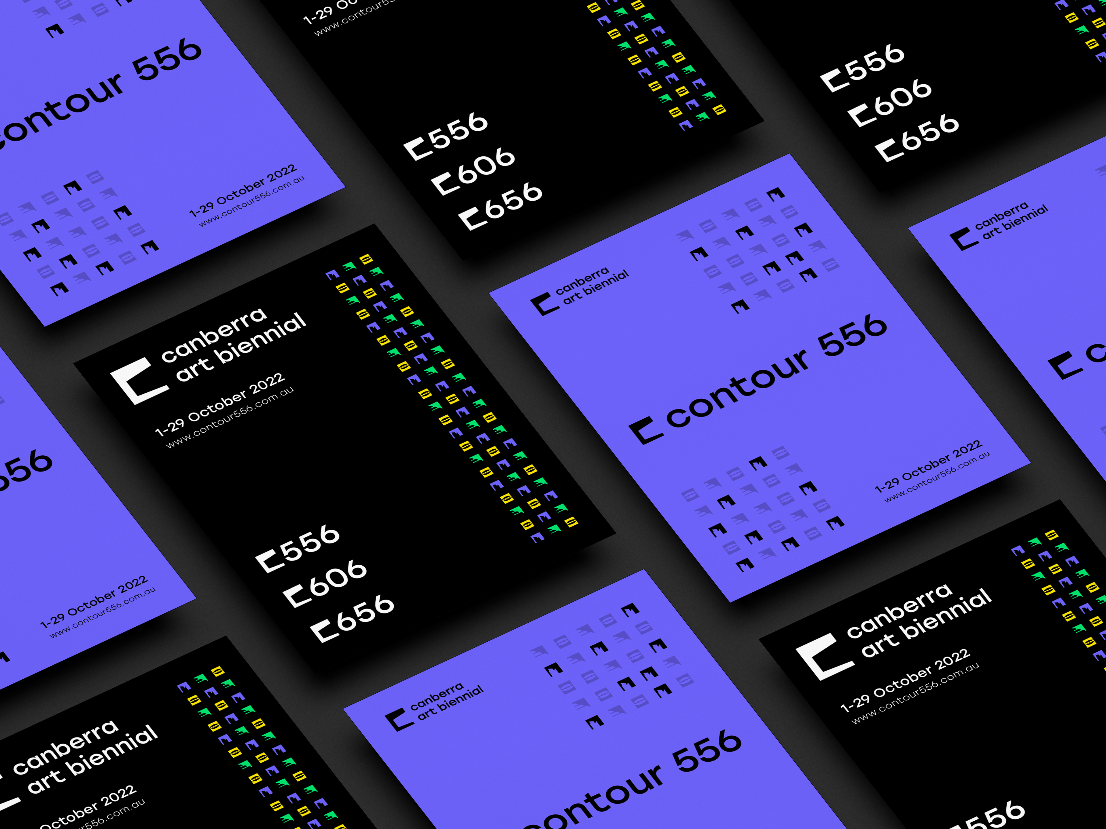
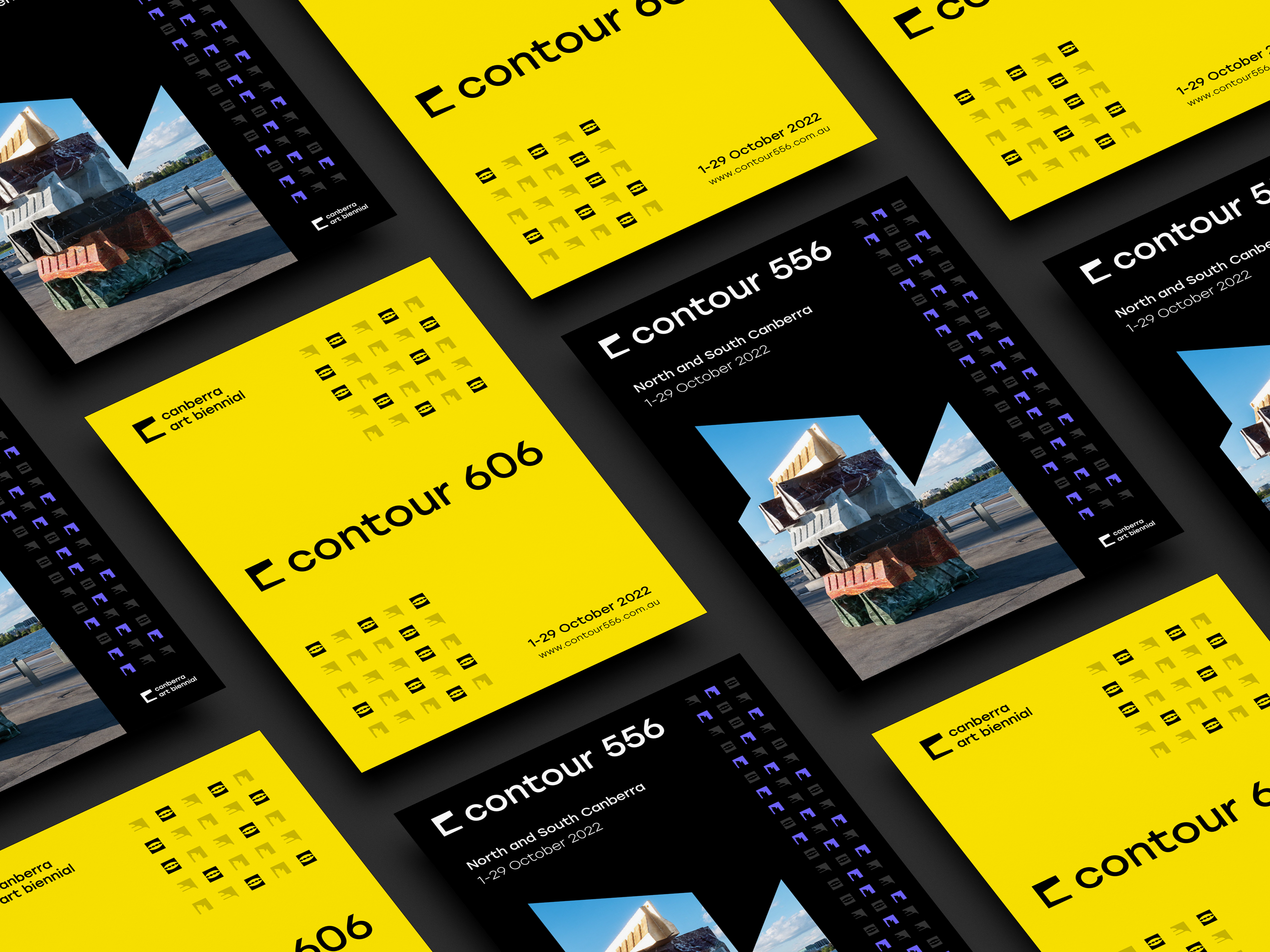
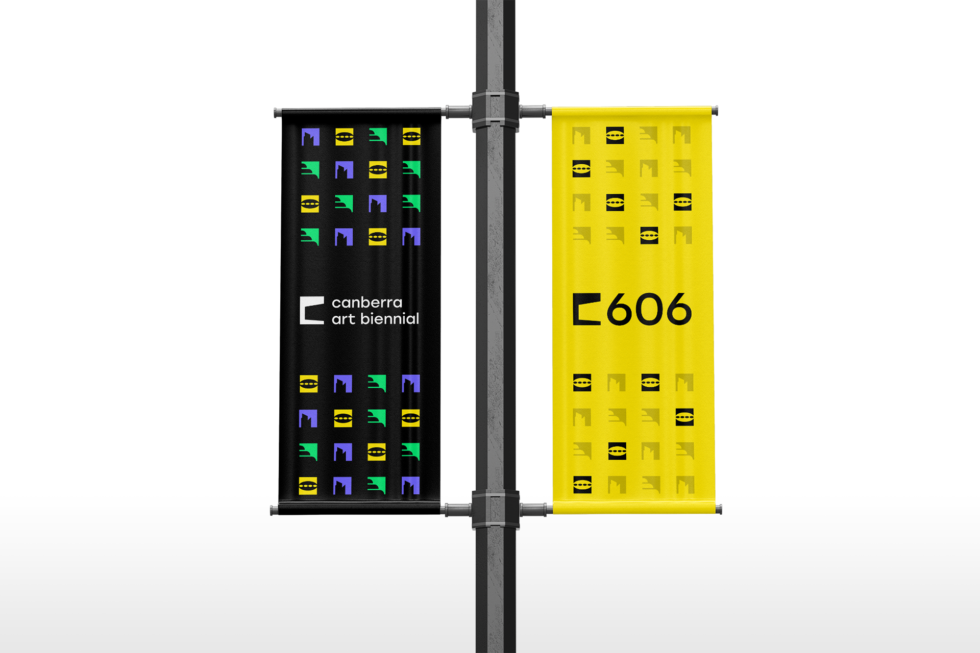
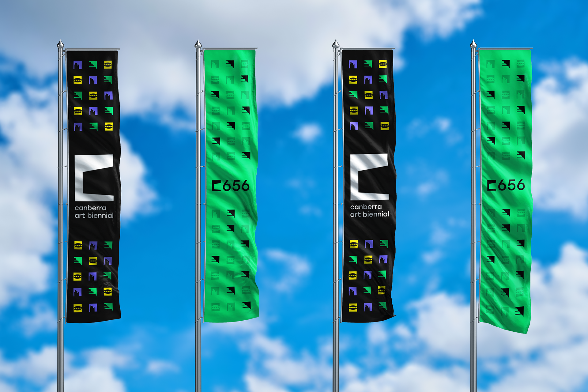
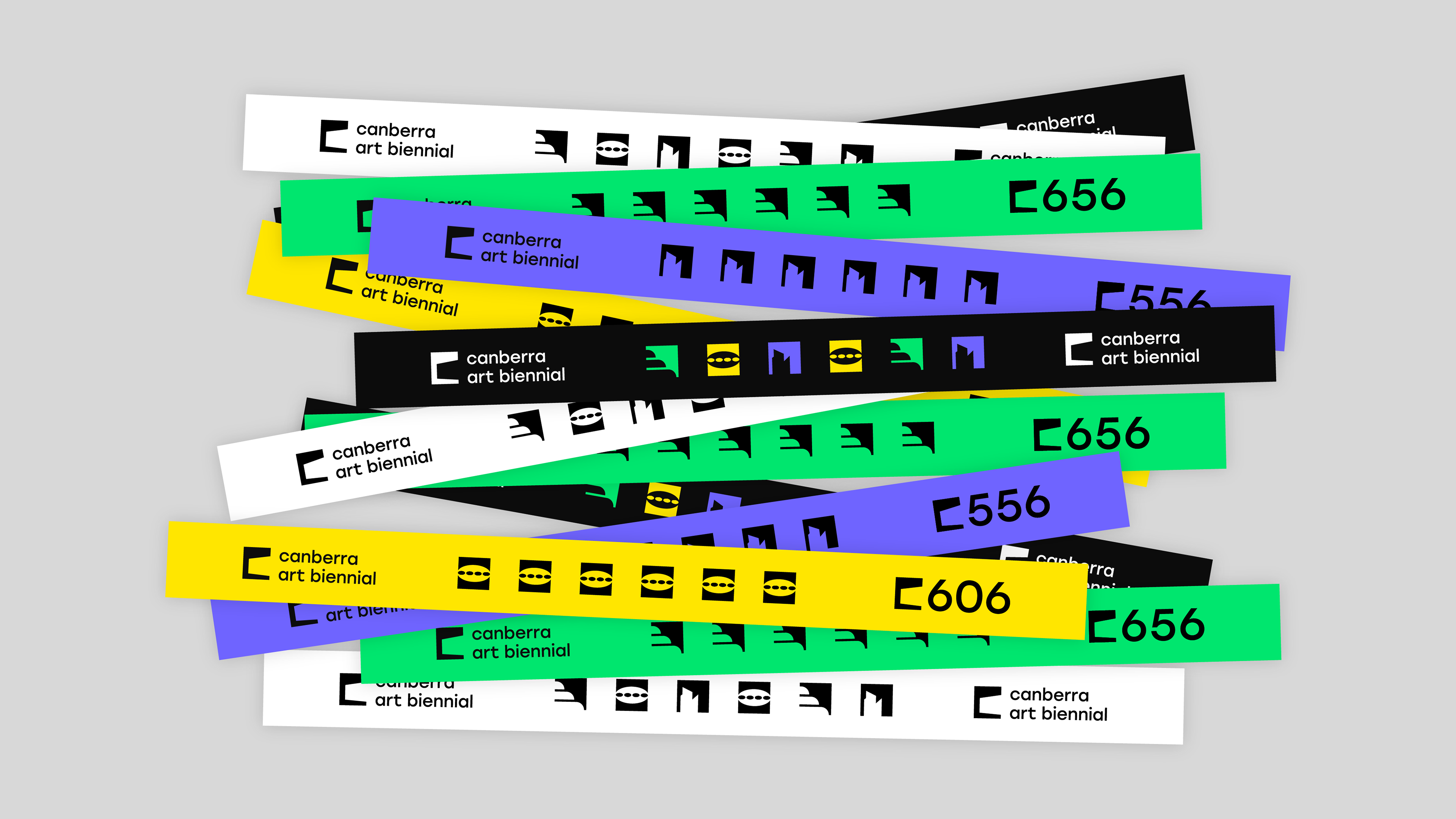
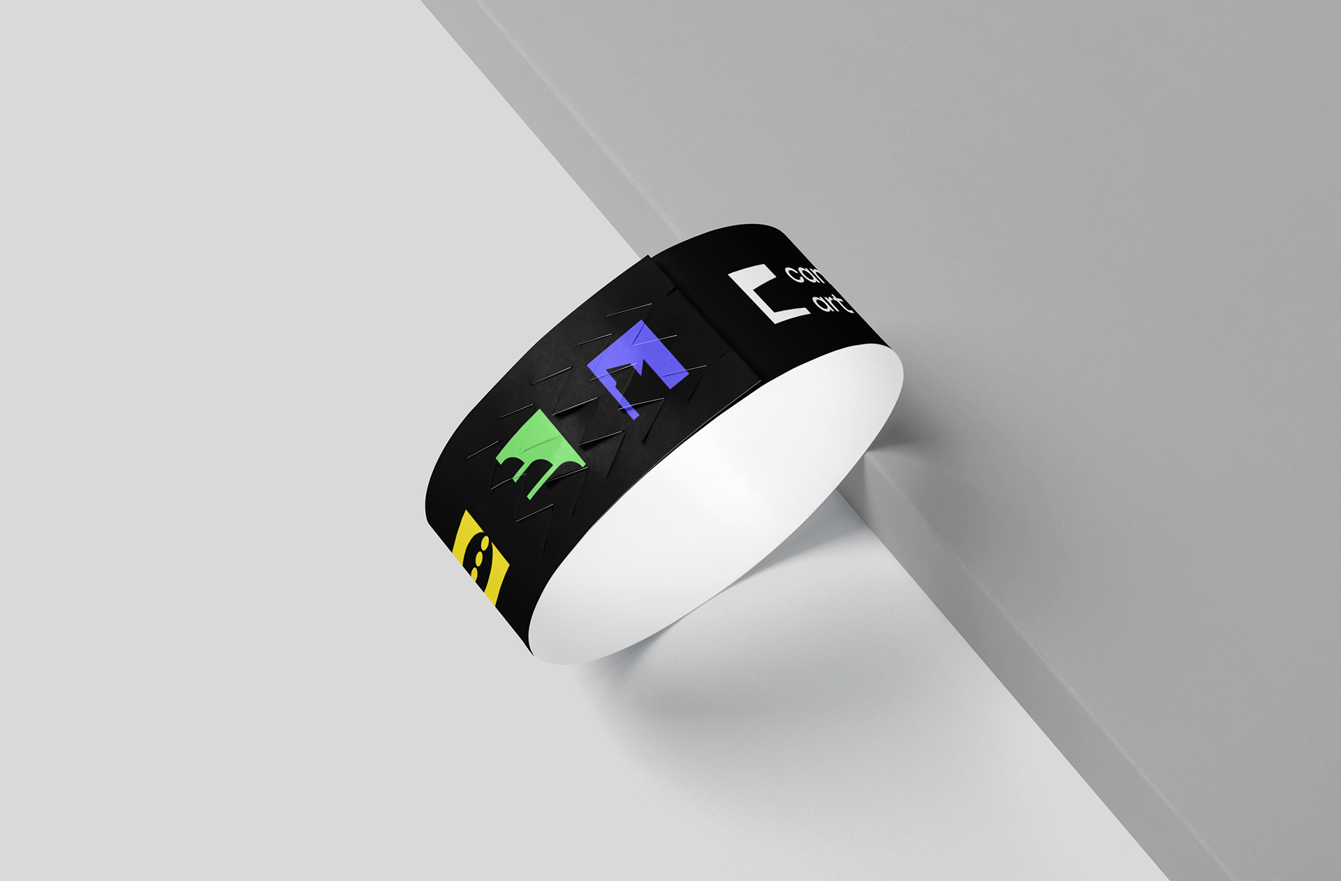
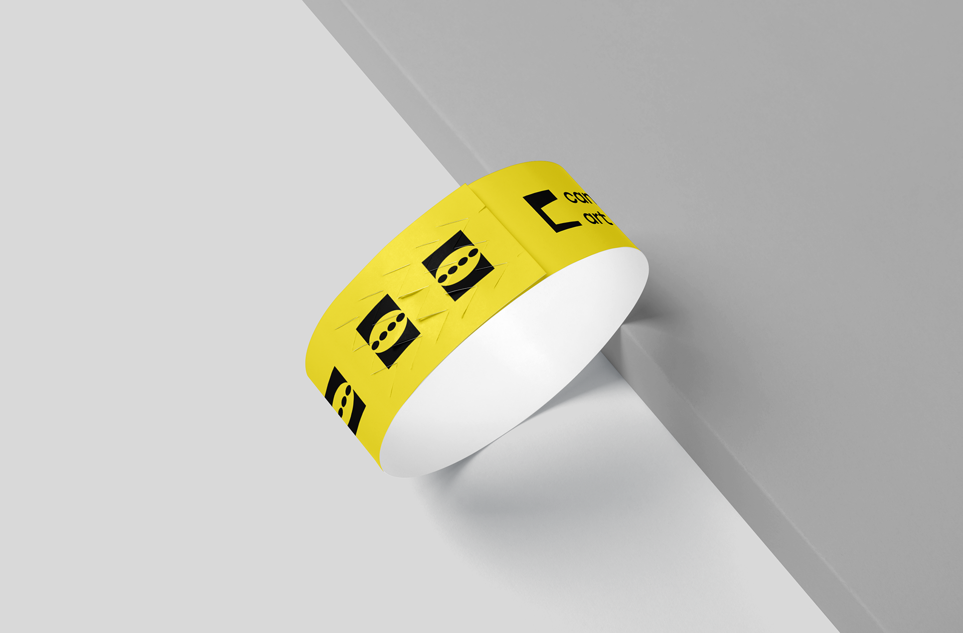
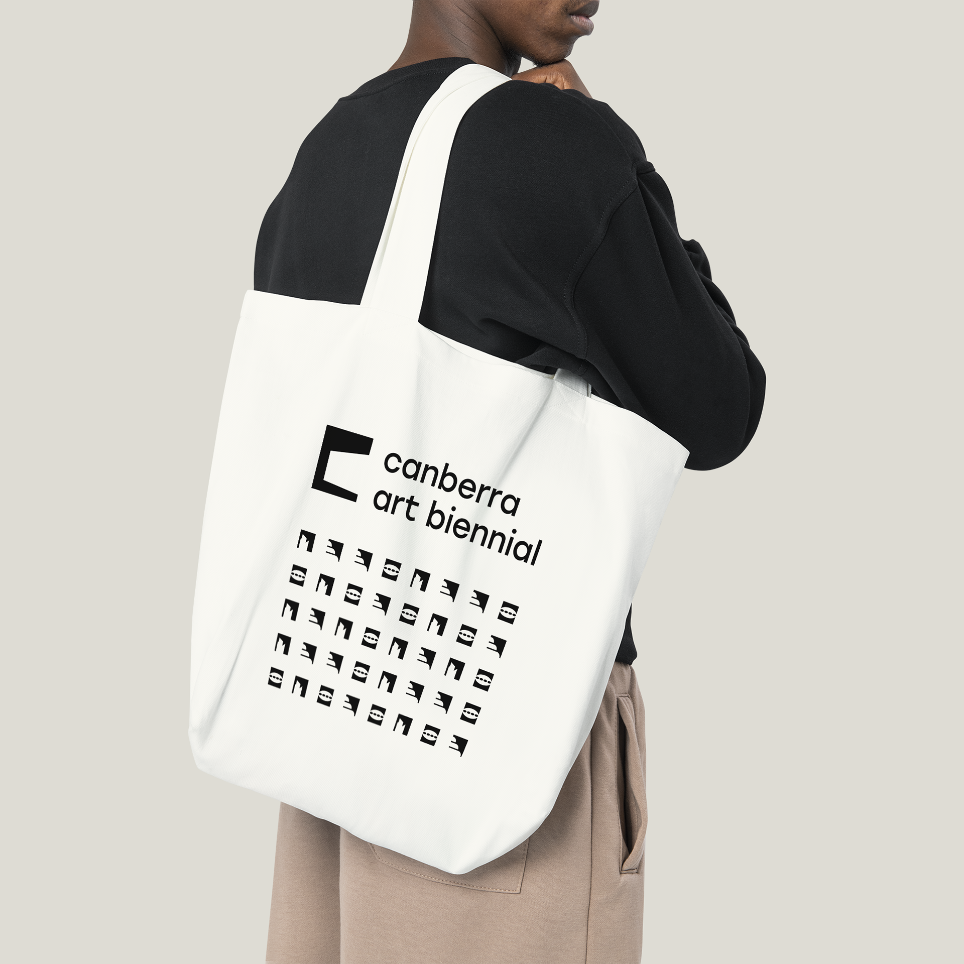
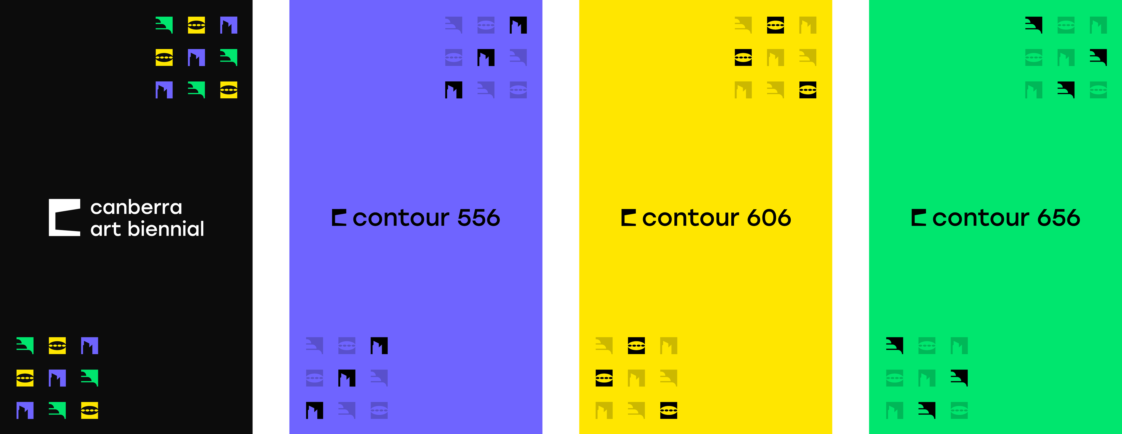
The overarching brand mark flows down smoothly for each of the three sites' logo. Each site also has an alternative icon that acts as a unique identifier. These unique icons expand on the concept for the brand mark by depicting a landmark from its site in the same treatment. When combined these icons form patterns that offer both consistency across the brand, and more personality for each of the three sub-brands.

Colour Scheme
hh
A vivid colour scheme pairs well with the bold and contemporary mark concepts. It is evocative just like the Canberra Art Biennial festival.
Applications