During recent lockdowns I decided to explore art direction through my love of music. I have always loved all types of music and dreamed of designing album covers, so I thought why not? These pieces are a great way for me to design with freedom and expand my creative thinking.
Throughout the ongoing collection, I challenge myself to visually represent the way a song makes me feel, what it reminds me of, or if an individual idea from one song could be developed into its own.
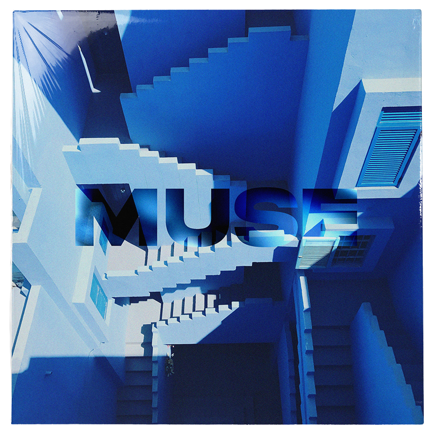
Muse
This piece was inspired by Innerbloom by Rufus Du Sol. Whenever listening to this quite lengthy song, I feel rooted to the spot, going deeper and deeper into thought. It is an amazingly paralyzing feeling, something that I would compare to meditation.
The spiraling staircase represents these feelings of falling deeper into thought, and also the tempo of the song that slowly descends until eventually finding its climax. I chose the term muse for its meaning ‘to be absorbed in thought’, which perfectly describes my interpretation of the song.
You shouldn't listen
This piece was inspired by the work of Genesis Owusu. He explores some controversial topics throughout his music, which is one of the reasons his work is so engaging. His work fostered the idea of ‘you shouldn't listen'. I see it as an excerpt from an extremist rant suggesting that we shouldn't always listen to what we are told, instead encouraging free thought.
I used various effects to warp the text and bring through grungy themes that give the design an underground feel, which I feel reflects the controversial message.

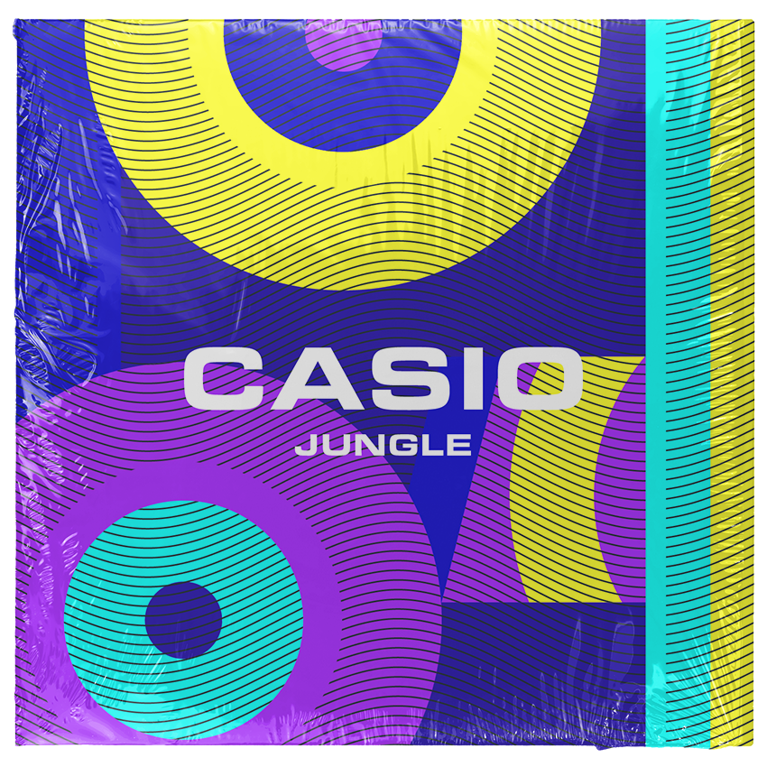
Casio
This piece was designed for the song Casio by Jungle. It is an upbeat modern indie track that is inspired by retro themes of funk. This funk is infectious and I can't help but bob my shoulders every time it comes on.
This funk feels a lot like nostalgia and makes me think this song belongs in the late 80’s and early 90’s. I believe it may have been another reason Jungle chose to name the song Casio, as a throwback to the retro sound systems.
I wanted to bring these themes into the design through a bold and fluorescent colour scheme inspired by 80’s/90s fashion. I chose to support this with graphic elements inspired by the speakers of a Casio boombox. I used the classic Casio font to top it all off.